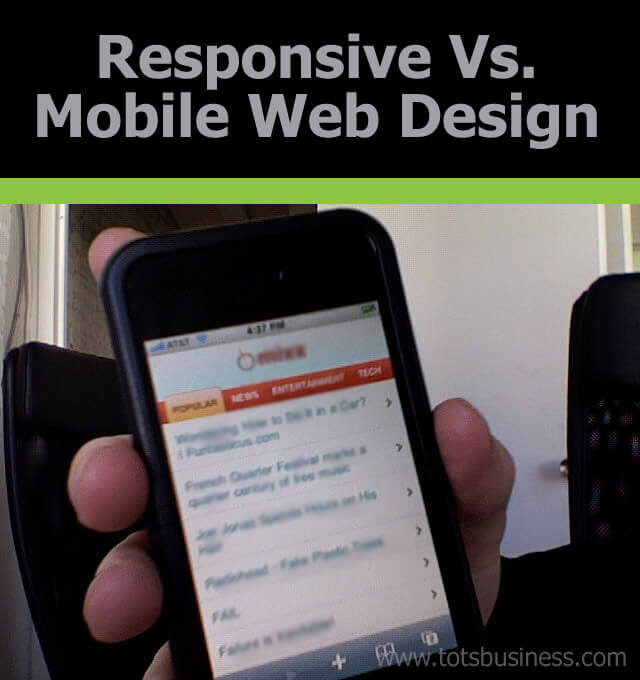
photo credit: martymadrid via photopin cc
The changes made to Google’s search engine algorithm with their latest Hummingbird update have given webmasters reasons to panic along with reasons to rejoice. Aside from deciding how their content would affect their site’s ranking, they also had to consider how the design would affect any SEO efforts.
When it comes to web design, one of the biggest decisions is choosing which approach to take with mobile compatibility. Choosing between responsive design and mobile web design can be a difficult task for site managers and business owners to make, but keeping in mind customer needs and page creator abilities can help to make the decision easier.
Mobile Design Pros
One of the biggest draws of a mobile web design is that it is easier for viewers to see the page. The content is consolidated and becomes more accessible and viewable on their mobile device. Additionally, the compact information takes away the problem of zooming or scrolling through the page to find things.
Consolidated information gives a company less time and space to show off every aspect of their brand to users. But this means that the information they have can and should have a real impact.
Mobile design makes for smaller pages, decreasing the page load. Marketing Charts reports that a mobile web design will typically load at least three seconds faster than a responsive design. Those few seconds’ difference translates to more users staying on a page instead of closing out while waiting for it to load.
Mobile Design Cons
A poorly designed and executed mobile web page could put a page’s rank at risk. Since it is double content split between two separate URLs, the page rank is often split between the two sites, resulting in a lower ranking for both of them instead of one combined high rank.
A mobile web design takes elements of the standard responsive web design for a desktop it is not the exact same design. Therefore, any edits or adjustments made on the normal website would have to also be made separately on the mobile design. This adds to more maintenance time and costs on keeping up with mobile users.
There is not yet a solid way for Google to recognize that a site is for mobile users unless it explicitly says so on the site. This flawed system proves detrimental when mobile users are searching for a site. The keywords and phrases they use are often different from what would be used on a standard desktop search. Therefore, the best results won’t always turn up, particularly if a user searches for something like, “What are the best mobile games for iPhone 5?”
If users are looking for specific information, a mobile web design may not be the best bet. Mobile designs work better for users who are looking for an interactive experience rather than one where they can find information because the information on these sites is typically more consolidated and not always present.
Responsive Design Pros
A responsive web design allows the same design used for desktops to be translated over for mobile viewing. The main adjustments are scaling down various aspects of the site and hiding the applications that won’t be needed on a mobile device. Since this is the case, there is no concern about splitting the page rank between the mobile site and the regular site — so long as the responsive design is constructed properly.
Matt Cutts, head of Google’s webspam team, has told web developers that a responsive design for mobile devices will be better for SEO efforts. Rather than risking the confusion of figuring out the rel=canonical with a mobile design, a responsive design takes away the risk of splitting page rank and allows you to keep the rank you want.
An additional pro for responsive design is that there is no need to create an entirely separate design for mobile users. Instead, the design is scaled down by percentages to fit onto any mobile device. If the regular design is good enough, working it into a responsive design should not be much of a problem.
Responsive Design Cons
A responsive web design is based around the needs of desktop users. As such, any keywords or content built will be around what desktop users are interested in. This does not always translate over to mobile users. Particularly considering that a typical desktop search through Google will include short phrases like “Montreal SEO services” rather than a longer search from a mobile user like “What are the best SEO services in Montreal?”
Not every part of a responsive design will work well with mobile devices. Aspects of the site that work well on a desktop will not always translate to mobile use. Even a well-designed sight can have flaws that make for complicated use.
Since the responsive design for mobility reflects the design for desktop users, it will keep many aspects of the original website. While some portions of the site can be hidden, they will still add to the page load time. This increased load time quickly loses users’ attention and decreases site traffic.
Regardless of the direction taken with design for mobile users, it is important that the design remain accessible and display the best features of a website. Whether that means that responsive design is best or mobile design is going to be the smarter option, choose a design that shows off the most impressive aspects of your business and gives mobile users what they want and need.
Theo Schmidt has an interest in computer science and engineering, and he uses that interest to fuel his blogging. For more information on online marketing solutions check out http://www.yellowpages360solution.ca.


i think responsive web design must be planned first